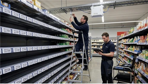
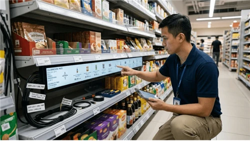
In June 2024, Walmart made an announcement that sent ripples through the retail industry: they're rolling out electronic shelf labels to 2,300 stores by 2026-that's roughly half their entire U.S. footprint.
The numbers behind this decision tell a story. A single Walmart store carries over 120,000 products. Before digital labels, updating prices across the store took an associate about two days. Now? A few taps on a mobile app, and every label in the building refreshes in minutes.
Greg Cathey, Walmart's SVP of Transformation & Innovation, didn't mince words: "[DSLs] have been a game-changer and [they simplify] the daily activities of our store teams."
But here's what makes this interesting for anyone running a retail operation: according to a December 2022 Forrester Consulting study, an ESL system effectively pays for itself within 18 months and produces a five-year ROI of 277 percent.
That's not a typo. 277%.
So what exactly is POP marketing, why does it matter this much, and what's changed in the past few years that's making the biggest retailers on the planet move this aggressively?
POP vs. POS
I'll keep this short because honestly, it's simpler than most articles make it sound.
Think of it like a restaurant. POP is the menu board with the juicy burger photo that makes you hungry. POS is the cash register that takes your $12. One makes you want it. One takes your money.
|
|
POP |
POS |
|
Job |
Get them to want it |
Get them to pay for it |
|
Where |
Aisles, shelves, endcaps |
Checkout counter |
|
Tools |
Displays, signage, screens |
Registers, card readers |
That's really all there is to it. If you remember nothing else: POP is about the decision. POS is about the transaction.
The Numbers That Should Make You Pay Attention
Alright, let's talk about whether any of this actually matters-because I know you're not here for theory. You want to know if POP moves the needle.
POPAI (now Path to Purchase Institute) has been tracking shopper behavior since 1965. Their 2012 Mass Merchant Shopper Engagement Study observed over 2,400 shoppers, and here's what they found: 76% of purchase decisions were made in-store, not before customers walked through the door.
By 2014, that number climbed to 82% in mass merchant channels. Richard Winter, POPAI's president, said something that stuck with me: "While we expected some mass merchant shoppers were waiting until the last minute to decide purchases, we were truly surprised to discover 82% of purchase decisions are made in the store."

Let that sink in for a second. More than 8 out of 10 purchases are still up for grabs when someone walks into your store. All that money spent on TV ads, social media, influencer campaigns-it gets people through the door, sure. But the actual decision? That's happening at the shelf.
And it's not just candy bars and gum we're talking about. The POPAI study broke it down by category:
Candy & gum: 89% in-store decision rate
Skincare: 83%
Pet supplies: 81%
Wine & spirits: 79%
Even the categories you'd think people research beforehand-skincare, pet food-still have massive in-store decision rates.
Here's another number I find fascinating: when a display featuring a specific brand was present in-store, nearly 1 in 6 purchases in that category went to that brand. Not because the product was better. Not because it was cheaper. Just because it was visible in the right way.
Why POP Works: The Psychology You Can Actually Use
Okay, so the data says POP matters. But why? What's actually happening in a shopper's brain that makes a display or a sign change their behavior?
I'm going to break this into three mental shortcuts that shoppers take-and more importantly, how you can design your POP to work with these shortcuts instead of against them.
Cognitive Load Reduction
The average American supermarket carries somewhere between 30,000 and 50,000 SKUs. Think about that for a second. Fifty thousand different products, all competing for attention.
Your brain physically cannot evaluate each one. It's not lazy-it's just operating under constraints. So what does it do? It cheats. It looks for signals that say "this one is worth your attention" and ignores everything else.
What counts as a signal?
A splash of color that breaks from the surroundings
A price callout that's bigger than the others
Movement-anything that moves
Position-eye level gets 35% more attention than bottom shelf
A 2019 study published in the Journal of Retailing found something interesting. Stores that implemented clear visual hierarchy signage-basically, making it obvious what to look at first-saw shoppers spend 23% less time searching. But here's the kicker: those same shoppers reported higher satisfaction scores, and they actually bought more.
That's not a contradiction. They bought more because they weren't exhausted from searching. They were happier because shopping felt easier.
This is an important reframe: good POP isn't about tricking people into buying things they don't want. It's about helping overwhelmed people navigate choices more efficiently. When you reduce cognitive load, you're providing a service.
So what does this mean for your displays?
Don't add more information. Subtract it. Every element on your POP should earn its place. If you've got a tag with a logo, a product name, a price, a barcode, a promotional message, and a legal disclaimer-you've got too much. A shopper's eye will bounce off it because there's no hierarchy, no clear "look here first."
Create visual interruption. Your display needs to look different from its surroundings to register as a signal. Same color as the shelf? Invisible. Same size as everything else? Invisible. You need contrast.
Eye level is real estate. Use it wisely. If you're paying for premium shelf position, don't waste it on a product that sells itself. Put your new launch there. Put your highest-margin item there. Put the thing that needs help there.
Loss Aversion
Here's a number that still surprises most people: humans feel the pain of losing something about twice as intensely as the pleasure of gaining the same thing.
This isn't marketing fluff. It's from Kahneman and Tversky's work on Prospect Theory-they won a Nobel Prize for it. The research has been replicated hundreds of times across different cultures and contexts.
What does this mean in a retail setting?
It means "Save $5" and "Don't miss $5 in savings" are not the same message. They feel completely different to a shopper's brain.
"Save $5" is a gain. It's nice. It's a positive.
"Don't miss $5 in savings-today only" is a potential loss. Your brain reads that as: if I don't act, I lose something. And that creates genuine discomfort-a low-grade anxiety that doesn't resolve until you either buy the thing or walk away.

Now, I want to be careful here because this can be misused. If every single sign in your store screams "LIMITED TIME! DON'T MISS OUT!" it stops working. Shoppers tune it out, or worse, they feel manipulated and lose trust.
The key is specificity and honesty.
"Today only" needs to actually be today only
"While supplies last" should only appear when supplies are genuinely limited
"Last chance" means it's actually the last chance
When you use urgency honestly, it works beautifully because you're genuinely helping people make a decision they might otherwise postpone. When you use it dishonestly-running "final sale" signs for three months straight-you train your customers to ignore you.
Concrete numbers beat percentages. "Save $15" registers faster than "Save 15%." The dollar amount is immediately tangible; the percentage requires mental math. If you're doing a percentage discount, at least add the dollar amount: "15% off - Save $15 on this item."
Deadlines need to be specific. "Limited time" means nothing anymore. "Ends Sunday 6PM" means something. If you're using digital signage, show an actual countdown. It sounds gimmicky, but the data consistently shows it works-because it makes the deadline real.
Why "Best Seller" Tags Are Worth Their Weight in Gold
When shoppers are uncertain-and most shoppers are uncertain about most products-they look for clues about what other people did.
This isn't sheep behavior. It's actually rational. If you don't have perfect information about a product, and you can see that thousands of other people chose it, that's genuinely useful data.
"Best Seller" tags work. "Staff Pick" tags work. "#1 in Category" tags work. Reviews and star ratings work.
A 2021 Harvard Business School working paper tested this with wine displays. Bottles labeled "Most Popular in Store" saw a 13.6% sales lift versus unlabeled controls. The wine was identical.
That's a 13.6% lift from a piece of paper and a few words. No discount. No special placement. Just a signal that said "other people chose this."
But here's where most retailers mess this up: they put "Best Seller" tags on everything, or they put them on things that aren't actually best sellers, or they put up "Staff Pick" without any indication of which staff member or why they picked it.
Social proof only works when it's credible. The moment shoppers sense that "Best Seller" is just a marketing tactic rather than actual data, it stops working.
Be specific. "Best Seller" is okay. "Best Seller - 2,847 sold this month" is better. "Sarah's Pick - I use this every morning" is even better because it's personal and specific.
Use scarcity carefully. "Only 3 left in stock" is powerful social proof because it implies other people have been buying it. But if the shelf is always showing "Only 3 left" for months on end, you've broken the trust.
Reviews matter, even in physical stores. More retailers are now printing star ratings and review snippets on shelf tags. It sounds like an online tactic, but it works in physical stores too-because it's the same psychology. People want to know what other people thought.
IKEA, ALDI, and What They Actually Figured Out
Let me share something that I think gets missed when people analyze these companies.
Everyone talks about IKEA's showroom layout and the genius of the "forced path." But that's not the real lesson for POP marketing. The real lesson is in their price tags.
Next time you're in an IKEA, look closely at how they write product information. You won't see:
"KALLAX Shelf Unit - Particleboard with laminate finish, 77x147 cm"
You'll see something like:
"Finally, a place for all those books you keep meaning to read. KALLAX. $69."
Or on a bedding display:
"800 thread count. Because you spend a third of your life asleep-might as well be comfortable."
This is problem-solution copywriting at shelf level. They're not listing features. They're acknowledging a frustration the customer already has and immediately presenting the product as the resolution.
This works because of cognitive load reduction-they're doing the mental work for the customer. Instead of making you figure out why you might want a shelf unit, they're telling you: "You have books piling up. Here's the solution."
ALDI does the exact opposite-and it works just as well for their audience.
ALDI's signage is almost brutally simple. Massive black numbers. Direct price comparisons between their private label and national brands. No lifestyle imagery. No clever copy. Just:
"ALDI SimplyNature Almond Butter: $4.99. National Brand: $8.49. Same ingredients. Check the label."
Why does this work? Because ALDI's core customer has already self-selected as a value-conscious shopper. They don't need to be persuaded that cheaper is better-they walked into ALDI precisely because they already believe that. What they need is proof that they're not sacrificing quality.
The side-by-side comparison provides that proof instantly. It's social proof (the national brand is the reference point), loss aversion (you're "losing" $3.50 if you buy the national brand), and cognitive load reduction (the comparison is already done for you) all in one sign.
The lesson from both isn't "copy IKEA" or "copy ALDI." It's this: your POP must match your customer's mindset when they walk through the door.
IKEA customers arrive thinking about possibilities-what could my home become? So IKEA's POP speaks in possibilities.
ALDI customers arrive thinking about value-how much can I save? So ALDI's POP speaks in comparisons and numbers.
What is your customer thinking when they enter your store? Is your POP answering that question, or is it talking about something else entirely?
Static vs. Digital: It's Not Either/Or
One thing I see a lot is retailers thinking they need to choose: paper or digital. All in on screens, or stick with what's working.
That's the wrong framing.
Static POP (paper tags, acrylic stands, hanging signs) is cheap, fast to deploy, and doesn't need electricity. For stable-price, low-consideration categories-think spices, staples, basic commodities-paper is still the most cost-effective choice. It works. There's no reason to fix what isn't broken.
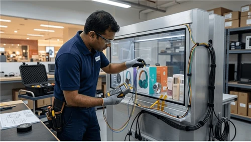
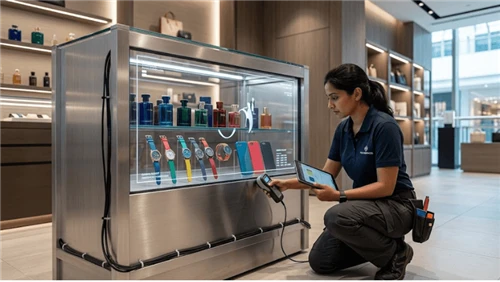
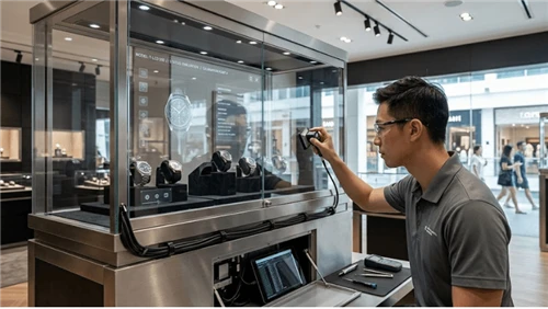
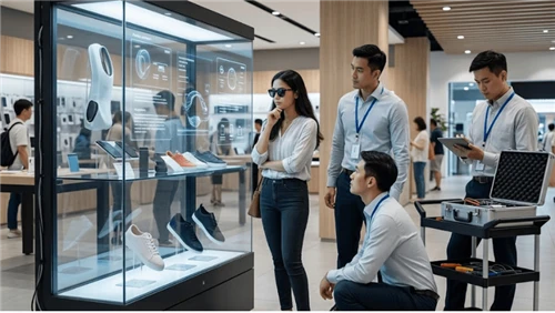
Digital POP (electronic shelf labels, LCD screens, transparent displays, kiosks) makes sense when flexibility and speed matter. Price changes multiple times a day? Promotions that need to sync across 50 locations instantly? High-margin products that benefit from video storytelling? That's where digital earns its higher upfront cost.
The smart approach is category-by-category allocation:
|
Category Profile |
Recommended POP |
Why |
|
Stable price, low engagement (spices, staples) |
Paper |
Cheapest, sufficient |
|
Frequent price changes (fresh produce, promo items) |
Electronic shelf labels |
Labor savings, accuracy |
|
High-ticket, needs education (skincare, electronics) |
LCD screens |
Video and motion convert better |
|
Premium showcase (jewelry, watches) |
Transparent displays |
Product stays visible, info overlays |
If you're thinking about digital, don't try to convert your whole store at once. Start with your highest-friction zones-usually fresh departments, promotional endcaps, or seasonal displays. Those are the areas where price changes happen most often, which means that's where the labor savings are most obvious and the ROI math is easiest to prove.
Things You Can Actually Do Tomorrow
Before I wrap up, here are a few things that don't require any new equipment-just a different approach to what you're already doing.
Make the price bigger, the logo smaller. Shoppers spend 3-7 seconds at the shelf. Their first question is "how much?"-not "what brand?" A lot of supplier-provided POP materials put the logo front and center because brand managers care about logo visibility. But shoppers don't. If you have any say in it, push for price at least 2x the size of the logo.
"Save $X" beats "X% off." Concrete numbers register faster than percentages. Kahneman's research backs this up. If your promo signs currently say "15% off," try testing "Save $15" and see what happens.
Give hesitant shoppers a default option. If you've got five SKUs on a shelf and sales concentrate in one or two, help the undecided shoppers by marking the popular one. "Store's 1 Seller" or "Most Popular Choice" removes the anxiety of choosing wrong. You're not manipulating anyone-you're helping them decide.
Every promotion needs a real deadline. "Special Price" has zero urgency. "Special Price - Ends Sunday" has urgency. If you're using digital signage, show an actual countdown clock. If paper, at minimum print the end date.
The Bigger Picture
Let's zoom out for a second.
Global ESL shipments broke 100 million units in Q3 2024. By the first half of 2025, that number was nearly 300 million-a 211.4% year-over-year increase. Grand View Research estimates the market at $1.85 billion in 2024, projected to hit $7.54 billion by 2033.
Walmart's deployment is driving a lot of this, but the broader signal is that this wave is expected to encourage adoption among other retailers too.
What does that mean for you? Honestly, it depends on your situation. "Everyone's doing it" is a terrible reason to spend money. But if you're dealing with:
Price changes eating up floor labor every week
Pricing errors causing customer complaints
Competitors whose stores look more modern than yours
Promotions that are logistically painful to execute
...then it's probably worth at least running the numbers.
Wrapping Up
POP marketing isn't complicated. At its core, it's just this: at the moment a customer decides to buy, give them a reason to say yes.
That reason might be price (ALDI). It might be lifestyle (IKEA). It might be efficiency (Walmart). The psychology is the same-reduce cognitive load, leverage loss aversion, provide social proof-but the execution should match your customer's mindset.
The hardware-paper, e-ink, LCD, whatever-is just the carrier. The message is what matters. Get that right first.
If you want to talk through what digital POP might look like for your situation, or just want to sanity-check whether it makes financial sense, we're happy to chat. No obligation. Sometimes the answer is "stick with paper for now," and we'll tell you that if it's true.
Quick links if you want to browse

E-ink, 2.66" to 7.3", 5+ year battery

28" to 49.5", single or double-face

27x10" and 42x23", touch optional

Touchscreen terminals